Bringing clarity to complexity: what I’m learning (and loving!)
Happy February! Hope 2025 is off to a great start for you.
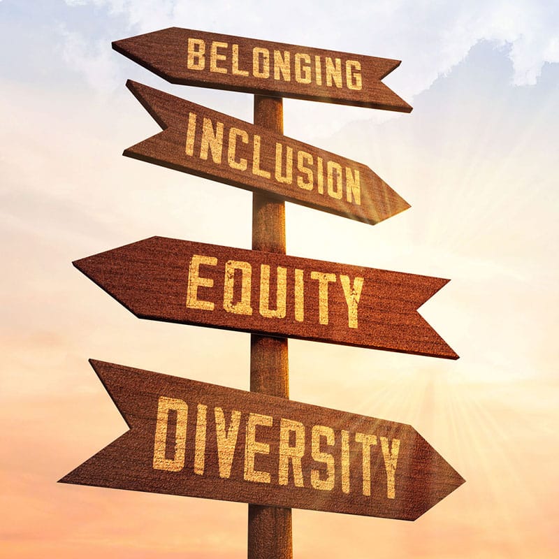
Lately, I’ve been diving into diversity, equity, inclusion and belonging (DEIB)—not just as an observer, but as a designer who wants to help clients champion these values in their marketing and development efforts. With DEIB programs facing increased scrutiny and total elimination within our government, it’s more important than ever for schools and nonprofits to uphold and embody these inclusive, community-building principles.
I’ll be the first to admit: I have a lot to learn about DEIB. So, I’m making it a priority to educate myself.
In my research, I came across Charlotte Country Day School’s 21-Day Equity Challenge and was struck by this simple but powerful illustration on the challenge landing page that explains the nuances of DEIB—breaking down equity vs. equality in a way that just clicks.
It’s the kind of visual clarity I strive for in my own work.
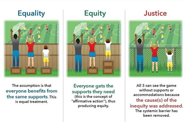
At the heart of it all, we’re more alike than we are different. And when we take the time to embrace and learn from our differences, we build stronger, richer communities—and lives.
Designing for Leadership & Inclusion
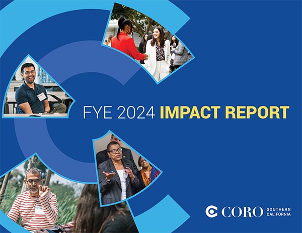
That’s why working with Coro Southern California on their 2024 Impact Report was so meaningful. Coro is a nonprofit that develops leaders from all backgrounds—teaching them how to navigate differences, build bridges, and take action for positive change.
Their belief? Leadership isn’t about title or power—it’s about stepping up, speaking up and making a difference. And that’s exactly what DEIB is about too: ensuring that everyone has a voice, a seat at the table, and the opportunity to contribute in a meaningful way.
At km design, my strategic messaging partner Jim Stadler and I worked closely to translate Coro’s mission into a bold, clear and visually engaging report—one that not only looks great but also communicates their impact effectively. And nothing makes us happier than hearing how it’s helping:
We hired km design to create our Annual Impact Report, and the results were outstanding! Karen and Jim brought creativity, clarity and strategic thinking, turning our complex work into compelling stories. The report has already helped generate increased donor interest and record-breaking individual giving!
— Olivia Ray, Director of Development & Communications,
Coro Southern California
Designing Reports That Make an Impact
Over the past year, report design—from annual and impact reports to CSR and strategic action plans—has become a major focus for our studio.
Most recently, I’ve been working on data-driven reports—and, surprisingly, I’m loving it! At first, the idea of designing charts, graphs, and tables didn’t excite me, but as I got deeper into the work, I discovered how much I enjoy transforming raw numbers into engaging, easy-to-understand visuals. It’s like solving a puzzle—figuring out how to make complex information digestible and visually compelling.
One recent highlight? The State of Our Data Report for a leading university-backed research facility. This project stretched my skills, challenged my thinking, and reaffirmed my belief that great design isn’t just about aesthetics—it’s about clarity and impact.
Need a Creative Partner for Your Next Report?
If you have an impact report, annual report or research report on the horizon and want to ensure it makes a lasting impression, let’s talk. Email me to schedule a free 30-minute consultation.