‘Tis the season… Christmas in July? … No, annual report season.
Whether you’re a for-profit business or a non-profit organization, an annual report is a yearly, one-of-a-kind opportunity to create raving fans of your shareholders, stakeholders and donors. But here’s the catch, it sure helps if they read it.
Engaging your audience begins with content. When it comes to developing a non-profit annual report, “Content is KING 👑” But that’s only the beginning… Not only do you need to develop cohesive and compelling content that follows the thread of your report theme and supports your brand personality and mission, but you must also present that content in an engaging and easily-digestible format. (Phew… sounds like a lot of heavy lifting, huh?)
To help you get started, here are eight steps to a kicka$$ (and I do mean 🤑💰) annual report:
1. Hire a professional copywriter.
Surprised a graphic designer would lead with the suggestion to hire a copywriter? Yep, it’s one of the most important ingredients in km design’s secret sauce. A copywriter brings two very important things to your annual report: the ability to write truly compelling copy AND the objectivity to see and position your non-profit, its mission/vision/values in a way that you and your team, by nature, just can’t. (BTW – km design provides comprehensive copywriting services, and we STRONGLY encourage our clients to take advantage of this one-two creative punch.)
2. Leverage the power of a simple “thank you”.
… And say it over and over and over again. Sprinkle sentiments of gratitude and appreciation throughout your annual report – from the opening letter from the Executive Director and Board Chair to the closing list of donors. Underline all your accomplishments by acknowledging the impact of donors and volunteers. Drive home the point: We couldn’t have done it without you.
3. Make your report skimmable.
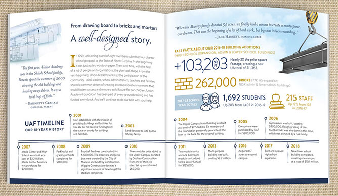
Let’s face it… you have maybe 5 seconds to draw your reader in. (No pressure!) Your best strategy is to create a content hierarchy that guides the reader through the report by a series of powerpacked-info nuggets. Photo captions, side bars, infographics and quotes from individuals are a great place to start. If you’ve done your job well, those nuggets will spark interest and compel your reader to go deeper.

4. Energize your accomplishment reporting with infographics.
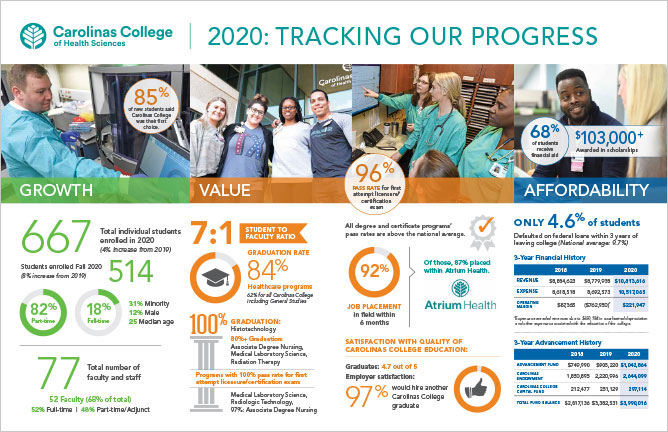
As a non-profit, it’s crucial to demonstrate good stewardship. Historically, that was done with bar charts and pie graphs. 🥱 Infographics accomplish the same thing but in a much more creative, dynamic, interesting and impactful way.

5. Whenever possible, use original photography.
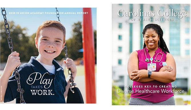
Photography creates emotional intimacy and a connection to your audience. Original photography conveys authenticity and offers a glimpse into the heart of your organization – its clients, employees, volunteers, stakeholders and donors. If you have a limited budget, choose a couple high profile pages of the report, e.g., the cover and an inside page leading into a feature article, to invest in original photography.

6. Tell your story from different perspectives.
Your organization is multi-faceted, and your audience is diverse. In order to tell your story in a way that inspires more raving fans, you must tell different versions of that story – from a client whose life was positively impacted, from a volunteer, from a stakeholder, from a community partner, from a donor. This inclusive approach invites the reader to “try on” different ways of supporting your organization to see what fits them best.
7. Think “outside the report”.
Once you’ve finished, share the report’s content liberally on social media. Repurpose infographics, donor profiles, client success stories, photos, sidebar articles and other powerpacked-info nuggets on Facebook, Instagram, LinkedIn, Twitter, etc. And always be sure to link back to your website, the digital version of the annual report (housed on your website) or the “DONATE” page on your website.
8. Make the path to giving/getting involved/joining the cause EASY!! Once you’ve inspired a new raving fan, make it clear what they should do next. Sprinkle calls to actions (CTAs) relative to different content throughout the report (e.g., a link to your donate page at the end of a client success story, a link to your volunteer page in a photo caption of a volunteer assisting a client, a remittance envelope tucked in with your donor list). Make it easy for your new supporter to act immediately.
As you can tell, I really LOVE working on long form publications like annual reports. If you’re ready to level up your alumni magazine, viewbook or annual report, let’s talk!
