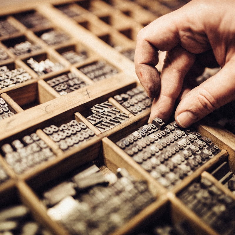
Type-face that is… Do you have any favorites? As a graphic designer, I spend lots of time selecting and searching for new and interesting typefaces. Choosing the right type is crucial for effective brand marketing because it not only reflects your company’s personality, but also serves as a foundational element in establishing your brand’s visual identity. Plus, it’s such a beautiful art form!
Just for fun, I thought I’d share my five go-to typefaces and a km design portfolio piece showcasing each one:
1. Trade Gothic
Trade Gothic is an versatile, condensed, sans serif face with a contemporary feel. Because it’s condensed, it works well in headlines (even lengthy ones) to maximize point size and impact without running too long and compromising the layout’s visual balance.
UNC Pembroke’s Alumni Magazine: Trade Gothic is one of the featured typefaces in the redesigned UNCP Today. In the original layout, the magazine used Avenir exclusively. I wanted to mix it up a bit and added Trade Gothic and Sanchez Slab for headlines and kept Avenir as the body copy. I also used Trade Gothic in the redesigned magazine masthead.
2. Adobe Garamond
Adobe Garamond is a classic serif typeface that conveys timeless elegance and integrity. It speaks of history and tradition and is one of the most readable typefaces there is – even at small point sizes.
Belmont Abbey College Corporate Brochure: Adobe Garamond was the perfect complement to Belmont Abbey College’s custom-designed, old-world typeface Belmont Abbey. This 16-pg brochure introduces the College and adult degree program to regional corporations looking for a higher education partner to provide academic and professional development for their employees.
3. Avenir
Avenir is a popular sans serif typeface that has a clean, open nature that conveys credibility and approachability. In contrast to a condensed face, Avenir’s characters are wide – the O is a perfect circle, which is somewhat unusual – making it a nice complement to condensed typefaces like Trade Gothic and Geared Slab (see below).
Carolinas College BSN Launch Campaign: Avenir is one of the two brand typefaces used by Carolinas College of Health Sciences. Starting in Fall 2018, the College will launch its first bachelor degree program in Nursing. As part of the launch campaign , km design concepted and designed two ads to announce the BSN program.
4. Geared Slab
Geared Slab is a chunky, condensed, serif face with a collegiate feel mixed with a slight quirkiness. It’s best used as a display face (e.g. headlines and subheads – copy of shorter length at a larger size). Because of its condensed, chunky nature, it’s not real legible in smaller body copy.
Carolinas College’s 2017 Infographic Annual Report: I chose Geared Slab as the second brand typeface for the College to complement Avenir. You can see the two faces together in the 2017 infographic annual report which is a special insert in CCHS’s Spring 2018 alumni magazine.
5. Interstate
Interstate, as the name suggests, is often used on interstate signs. It has an edgy, techy feel with an underlying strength and stability. Its uniqueness makes it interesting enough for headlines yet it’s consistent enough to be quite legible in body copy.
After designing the Affinity Energy logo (using Trade Gothic for the logotype), I wanted a brand typeface – which needs to be different that the logo typeface – that spoke of innovation and expertise. Interstate was the perfect choice.
If you’re in search of my type (typography-lovin-freelance designer) for an upcoming projects, let’s talk. I have immediate availability and would love to dig into your project this summer.
